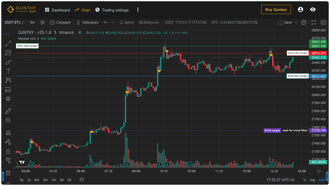
Visualize Strategy Targets
To monitor a custom strategy, trading targets can be visualized as lines on the chart in the Gunbot GUI.
This feature lets you track strategy performance in real time and make adjustments when needed. By visualizing targets on the chart, you can identify deviations from your desired outcomes and respond accordingly.

Horizontal Lines
Easy Method
If you set any of the following targets to a price, it is automatically drawn on the chart.
gb.data.pairLedger.customBuyTarget
gb.data.pairLedger.customSellTarget
gb.data.pairLedger.customStopTarget
gb.data.pairLedger.customCloseTarget
gb.data.pairLedger.customTrailingTarget
gb.data.pairLedger.customDcaTarget

// example:
gb.data.pairLedger.customBuyTarget = 60000
Advanced Method
As an alternative to the "easy" method, chart lines can be defined in the pair ledger as an array of objects with more properties than just price. The number of lines and/or line properties can be changed at any time, and the chart reflects changes within seconds.
gb.data.pairLedger.customChartTargets = [
        {
            text: 'some custom target line', // each line needs a unique text
            price: 91,
            quantity: '999', // setting an empty string '' omits the quantity field
            lineStyle: 2, // 0: solid, 1: dotted, 2: dashed
            lineLength: 5, // 0 (right) - 100 (left)
            lineWidth: 1 // 1: default, higher values lead to bolder lines
            extendLeft: false,
            bodyBackgroundColor: '#93cf53', // can also be set as hex string
            bodyTextColor: 'rgba(0, 0, 0, 0.7)',
            bodyBorderColor: 'rgba(0, 0, 0, 0.0)',
            quantityBackgroundColor: '#a6a6a6',
            quantityTextColor: 'rgba(0, 0, 0, 0.7)',
            quantityBorderColor: 'rgba(0, 0, 0, 0.0)',
            lineColor: '#93cf53',
        }
]
The following names cannot be used as the text property for chart lines because they would conflict with existing charting options in non-custom Gunbot strategies:
[
    "Resistance 1",
    "Resistance 2",
    "Support 1",
    "Support 2",
    "Buy at",
    "Pingpong buy",
    "Sell at",
    "Sell target",
    "Pingpong sell",
    "Break even",
    "Unit cost",
    "Entry Price",
    "Break even (short)",
    "Entry Price (short)",
    "RT BUY at",
    "RT BUY UP at",
    "RT SELL at",
    "RT SELL at ",
    "RT SELL UP trailing stop",
    "Buy trailing stop (tssl)",
    "RT Buy trailing stop",
    "Sell trailing stop (tssl)",
    "Buy trailing stop (tm)",
    "Sell trailing stop (tm)",
    "DCA trailing stop",
    "ROE trailing stop",
    "ROE scalper stop",
    "Stop limit",
    "DCA buydown",
    "Grid DCA target",
    "Grid sell target",
    "CLOSE at (fg)",
    "Grid sell trailing",
    "Grid sell trailing (fg)",
    "Grid buy trailing",
    "Grid buy trailing (fg)",
    "New position trailing",
    "New position trailing (fg)",
    "Buy target (c)",
    "DCA target (c)",
    "Sell target (c)",
    "Close target (c)",
    "Trailing target (c)",
    "Stop target (c)"
]
Multi-Point Shapes
You can draw any supported multi-point shape on the chart, such as colored rectangles to mark support zones. The example below shows one approach.
Multi-point shapes allow more complex visualizations on charts, such as trend channels or support/resistance zones, by connecting multiple price/time coordinates.
Technical info for each shape can be found on the TradingView Charting Library documentation and the list of possible overrides (note that TradingView documentation uses TRUE for boolean values, but they must be entered in lower case in your Gunbot strategy code).
// Sample data for the map function (replace this with your actual data)
const shortTermSupResChannels = [
    { top: 100, bottom: 80 },
    { top: 200, bottom: 150 },
    // Add more data entries as needed
];

// Function to calculate the latest timestamp from candle data (replace this with your actual data)
function getLastCandleTimestamp(candles) {
    if (candles.length === 0) return 0;
    return candles[candles.length - 1].timestamp;
}

// Code snippet to generate rectangles for short-term support and resistance channels
const shortTermSRrectangle = shortTermSupResChannels.map(data => {
    return {
        // Define rectangle points (top-left and bottom-right corners)
        points: [
            { price: data.top, time: 0 }, // The time is set to 0, you may need to adjust it based on your data
            { price: data.bottom, time: getLastCandleTimestamp(gb.data.pairLedger.candles.open) },
        ],
        options: {
            // First level options are needed for any shape
            shape: 'rectangle',
            lock: true,
            disableSelection: true,
            setInBackground: true, // When true, Gunbot places the shape behind other elements like bars
            overrides: {
                // See the list of overrides in tradingview docs for relevant overrides for each shape
                backgroundColor: data.bottom < gb.data.bid ? 'rgba(25,83,55,0.25)' : 'rgba(89,46,46,0.25)',
                color: data.bottom < gb.data.bid ? '#195337' : '#592e2e',
                textColor: data.bottom < gb.data.bid ? 'rgba(25,83,55,0.25)' : 'rgba(89,46,46,0.25)',
                fillBackground: true,
            }
        }
    };
});

// Save targets to gb.data.pairLedger.customChartShapes to get them drawn
gb.data.pairLedger.customChartShapes = shortTermSRrectangle;